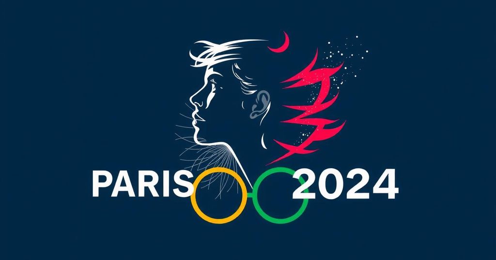
Symbolism of Inclusivity: The Female Face of the 2024 Paris Olympics Logo
Summary
The 2024 Paris Olympics logo, designed by Sylvain Boyer, features a female face as a transformative symbol of inclusiveness and female empowerment in sports. The logo combines elements of a gold medal, the Olympic flame, and the visage of Marianne, reflecting both tradition and contemporary progressive values. This novel representation challenges traditional gender norms and invites a broader conversation about gender roles in athletics.
The 2024 Paris Olympics logo stands out with its distinctive design and rich cultural symbolism, which signifies both tradition and modernity. The logo, a novel representation featuring a female face, embodies deeper meanings that challenge conventional perceptions of femininity in sports. Sylvain Boyer, the logo’s designer, alongside Zhang Tiecheng, who designed medals for the 2008 Beijing Olympics, delves into the logo’s inspirational roots and its broader cultural implications. The decision to feature a female visage on the Olympic emblem marked a significant departure from traditional representations; Boyer emphasizes that the female image is often exclusively linked to beauty. Instead, he sought to convey a more expansive representation of femininity. Zhang supports this notion by asserting that the Olympic Games promote inclusiveness across genders, enhancing the aesthetic and empowering nature of sports. The logo’s innovative design integrates the elements of a gold medal, the Olympic flame, and the face of Marianne, representing liberty and the French Revolution. The circular composition highlights a commitment to excellence in athletics, while the flame serves as a historical homage to the origins of the Olympics. Boyer’s daughter inspired the design, as he reflected on her experiences in a playground dominated by boys. Her comments sparked the understanding that women too deserve a prominent role in the Olympic narrative. Boyer acknowledges that traditional sports symbols heavily favor male imagery. However, with this logo, he seeks to redefine that narrative: “By placing a female face on the Olympic emblem, we have broken the traditional impression of people,” he stated. Discussions within his team revealed initial reservations about the feasibility of the design but ultimately coalesced around the belief that a feminine representation could effectively embody the Olympic spirit. The woman depicted in the logo features a short haircut, which symbolizes the progress of female emancipation since the 1920s. While the design initially featured red lips for greater femininity, the Olympic Committee suggested a color shift for broader appeal. Zhang described the logo as a unique creation that impressively balances simple circular lines with striking color changes to convey an innovative spirit. As women’s participation in sports continues to rise, the logo reflects the evolving landscape of gender roles within athletics. The designers emphasize that their work transcends mere aesthetics; it is infused with societal significance and a message of inclusiveness. “We are not designing just to be beautiful, but to make a clear impact on society,” Boyer remarked.
The Paris 2024 Olympics logo is a progressive emblem that signifies a shift in how women are represented in sports. This emblem not only aims to encapsulate traditional Olympic values but also endeavors to reflect contemporary societal changes, particularly in terms of gender equality and representation. The inclusion of a female face within the emblem marks a watershed moment in Olympic branding, as it challenges stereotypes and promotes inclusivity in sports. The design team, led by Sylvain Boyer, engaged in thorough discussions about the implications of using a female image, leading to a consensus that resonates with the current ethos of gender empowerment while celebrating athleticism across genders.
In summary, the 2024 Paris Olympics logo distinguishes itself as a pioneering symbol of inclusiveness and female empowerment within the sports domain. By featuring a female face, it not only enhances the portrayal of women in athletics but also invites a reevaluation of traditional sports imagery. The thoughtful design process highlights the relevance of gender equality in contemporary sports culture, as emphasized by both Boyer and Zhang. This logo serves not solely as a visual identifier for the games but also as a resonant social emblem advocating for transformation and inclusiveness within the sporting world.
Original Source: www.ecns.cn


Post Comment